Mega Nav Redesign
The problem
Marie Curie's website offers crucial information and support for individuals facing terminal illnesses and their families. Additionally, it caters to various user groups, such as healthcare professionals, volunteers, and donors.
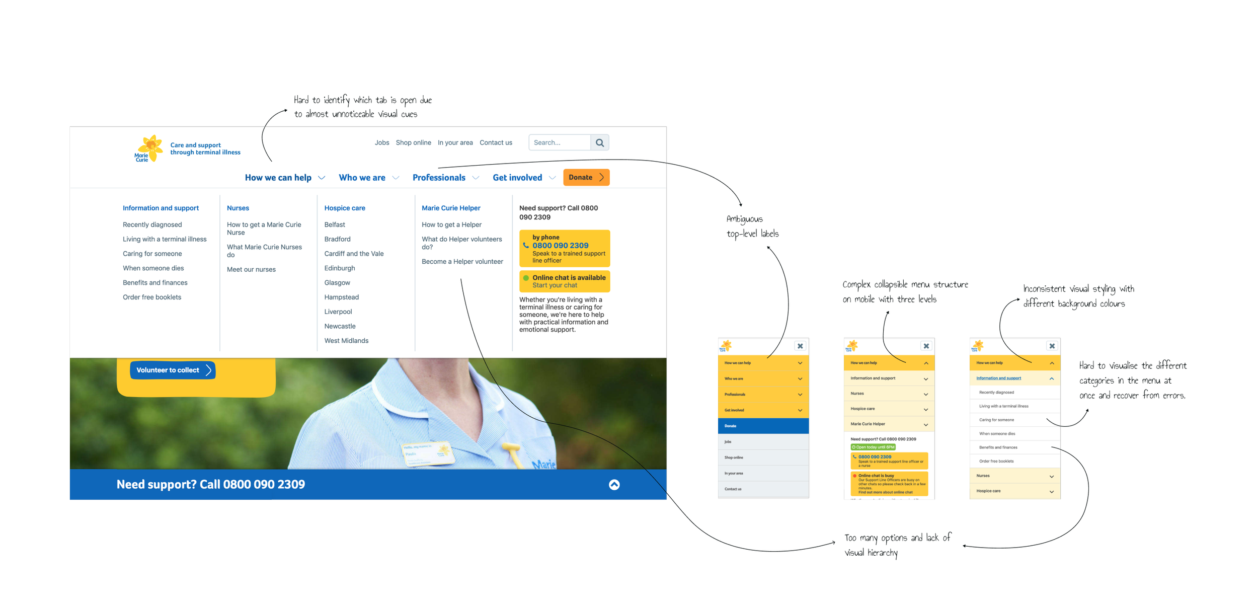
However, the website encountered challenges stemming from its complex navigation menu with unclear labels. This complexity often led users in frustrating loops, struggling to locate desired information, resulting in high drop-off rates and increased requests on the help section.

My role
My role was to investigate the underlying challenges users faced with the current navigation on desktop and mobile and provide a new design solution that was grounded on research findings.
I worked within the Digital Channels team that manages the website and monitors the site analytics. Throughout the project, I reported to the lead UX Designer, the Digital Channels Manager and the Information and Support Content Manager. Still, I worked autonomously to lead the research and provide design recommendations.
“I think there are some things that aren’t well labelled or labelled internally like how we talk about things rather than what someone might be looking for.”
Discovery
I ran an extensive Discovery phase to understand the underlying issues with the navigation for users and how it affected the business. The research methods included:
Interviewing business stakeholders
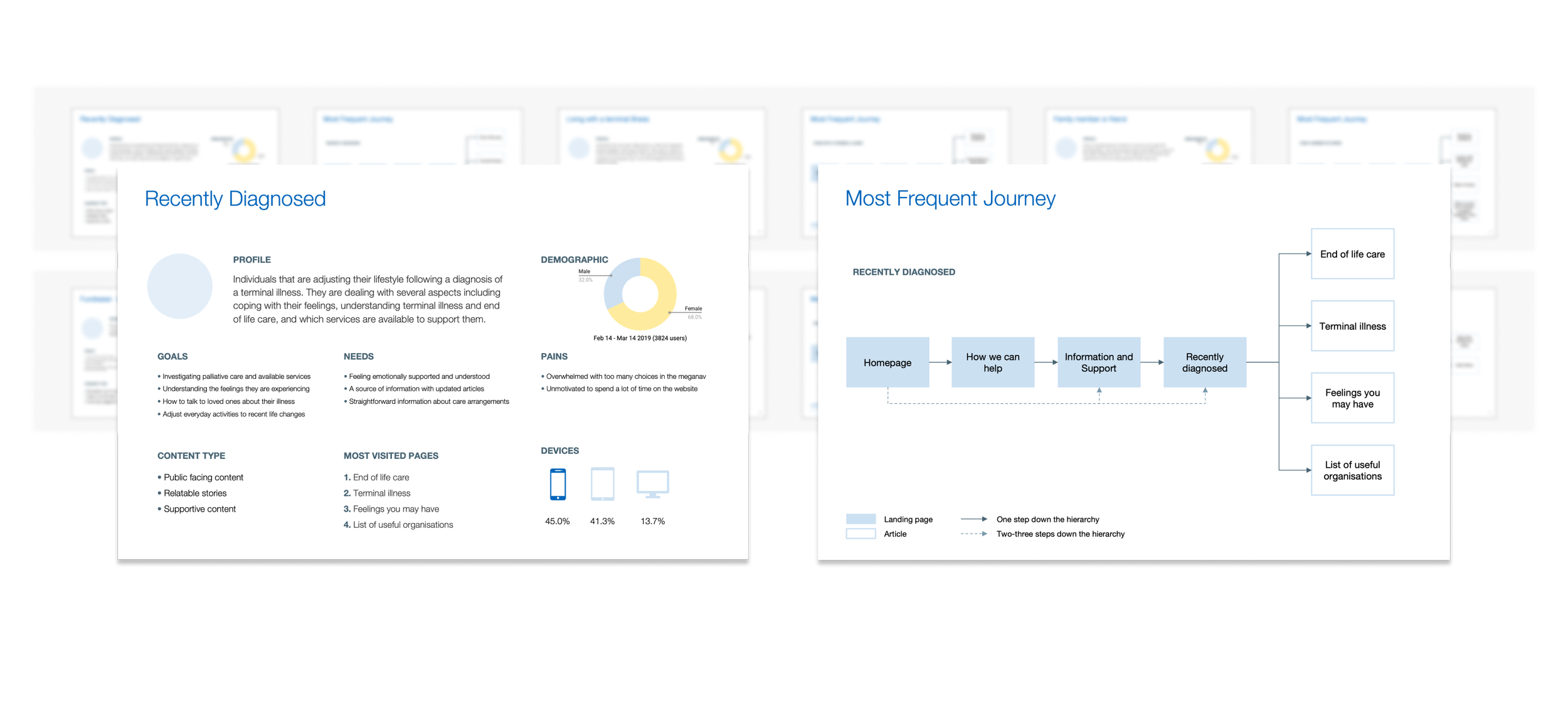
Identifying behaviour patterns among different user groups through Google Analytics reports
Reviewing key user journeys
Usability review of the website and research on competitors
Looking at previous research reports on attempts to improve navigation

Open card sorting
The remote card sorting activity was one of the key steps that informed the new proposal for the navigation architecture. The objective of the study was to understand the users’ mental model. Participants were asked to make their own groupings and name each group with a label they thought best represented the contents in it.
Our goal was to get a mix of participants from different target groups, particularly people seeking Information and Support content, as they were the user group that reported more struggles. Healthcare professionals and charity volunteers were also included in the study.
Analysis Method
I reviewed the data using an exploratory analysis framework from Card Sorting: Designing Usable Categories (Spencer D. 2009). The goal was to find patterns and insights into the data before using statistical methods.
Design
The challenge was to simplify the design of the meganav and use labels and groupings that are better understood by the users of the website.
Match users’ mental model by using the results from the remote card sorting test
Split items into primary and secondary links to establish a hierarchy.
Use visual design to make the menu look less cluttered and easier to navigate.
Key goals for the new meganav:
Prototype built with Axure
Usability testing results
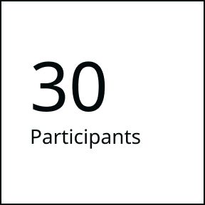
I created a clickable prototype on Axure to test an image-based design for desktop and mobile. Ten participants completed guided tasks and were interviewed by an independent researcher. These methods allowed me to get a deeper understanding of how users navigate the website and their views on the proposed solution.
“It seems to make sense where things are. I just think it’s a really clean layout and it’s easy to use.”
Impact
The redesign of the Marie Curie website's navigation menu was a multifaceted project where I leveraged my design, research and stakeholder engagement skills. The thorough research work helped unravel the genuine needs of users and secure buy-in from senior stakeholders for changing such an important website component. To build relationships with stakeholders, I included them throughout the process by playing back the research results at different stages and showing the rationale for the design decisions.
The impact of these efforts was noticed in:
Significant reductions in bounce rates across all user segments
Increased user engagement, reflected in longer average session durations
Noticeable improvements in task completion rates, indicating a more intuitive navigation structure
Stakeholder feedback praised the transparent and collaborative approach
Users appreciated the clearer organization of content and enhanced navigation experience.
“Genalda led the research and redesign of Marie Curie’s navigation. She brought creativity and superb insight and her expertise in UX was really beneficial for this project. I really enjoyed working with her. I highly recommend Genalda.”


